Building design systems

What is a design system

A design system is a set of standards to manage design at scale by reducing redundancy while creating a shared language and visual consistency across different pages and channels.

Why use a design system

Design process can be slow, painful, and unproductive. Creating a design system from scratch can be met with dismissal and skepticism, but the value added greatly overshadows the price. Some benefits of creating a design system include:

  • Save time: design and development work can be created and replicated quickly and at scale.
  • Focus: helps designers to focus on larger, more complex problems
  • Collaboration: creates a unified language within and between cross-functional teams.
  • Consistency: creates consistency (visual and behavioral) across all products, channels, and departments.
  • Scalability: allows for the products and company to grow and prevent design and development debt.

Drawbacks of using a design system

There are some potential hurdles and limitations which may prevent a design team from using a design system

  • Maintenance: design systems are not a one-and-done solution. At their best, they are constantly evolving as teams gather feedback from those who use them..
  • Adoption: any design system needs instructions — otherwise there is a risk that it may be applied inconsistently or incorrectly across screens or across teams.
  • Flexibility: having a design system can sometimes hinder some more creative solutions, depending on the company structure and goals..

Creating a design system

Foundation

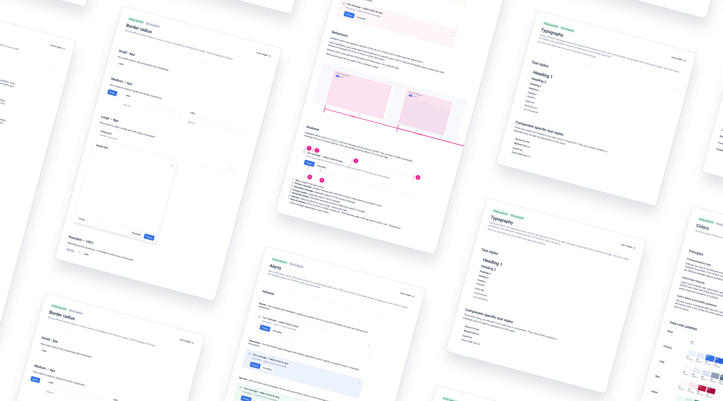
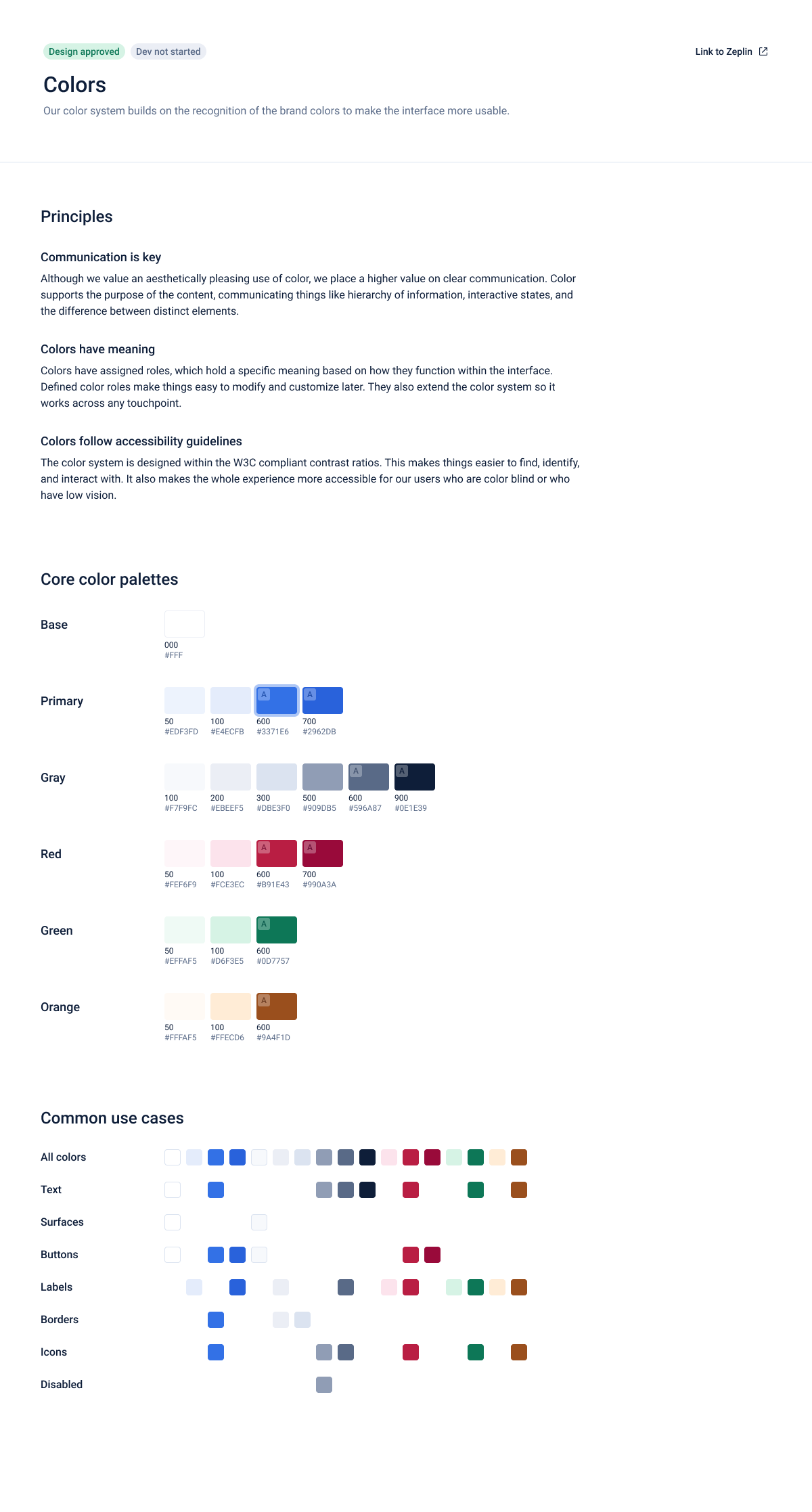
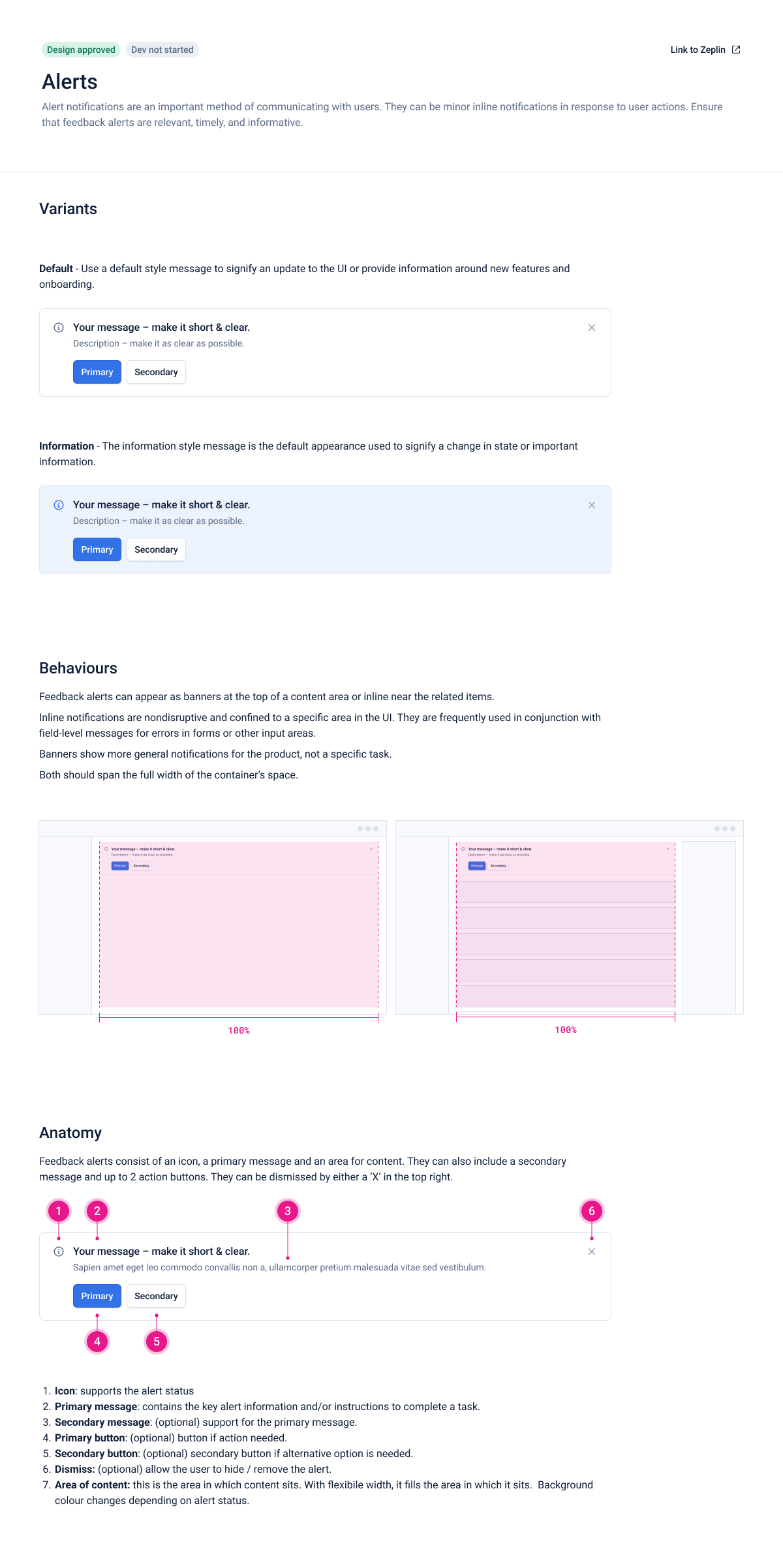
The foundation of a design system contain specific implementation guidelines, visual references, and design principles for creating interfaces or other design deliverables.

Common foundation documents guides:

  • Layouts
  • Colors
  • Iconography
  • Motion
  • Imagery
  • Typography
  • Communication
  • Writing

Components

Good design is assured by both the quantitative and the qualitative way of answering questions. Measuring usability helps validate our solutions and display any pain points that the user could have. Here are some of the insights that were discovered during the usability testing phase.

  • Component name: a specific and unique UI component name, to avoid miscommunication between designers and developers
  • Description: a clear explanation of what this element is and how it is typically used, occasionally accompanied by dos and don'ts for context and clarification
  • Attributes: variables or adjustments that can be made to customize or adapt the component for specific needs (i.e., color, size, shape, copy)
  • State: recommended defaults and the subsequent changes in appearance

A few notable examples would be:

  • Accordion
  • Alerts
  • Breadcrumbs
  • Buttons
  • Checkboxes
  • Dropdown
  • Empty state
  • File uploader
  • Inputs
  • Labels
  • Popover and tooltips
  • Radio buttons
  • Sliders
  • Toast notifications
  • Toggle

Advanced components

Slots

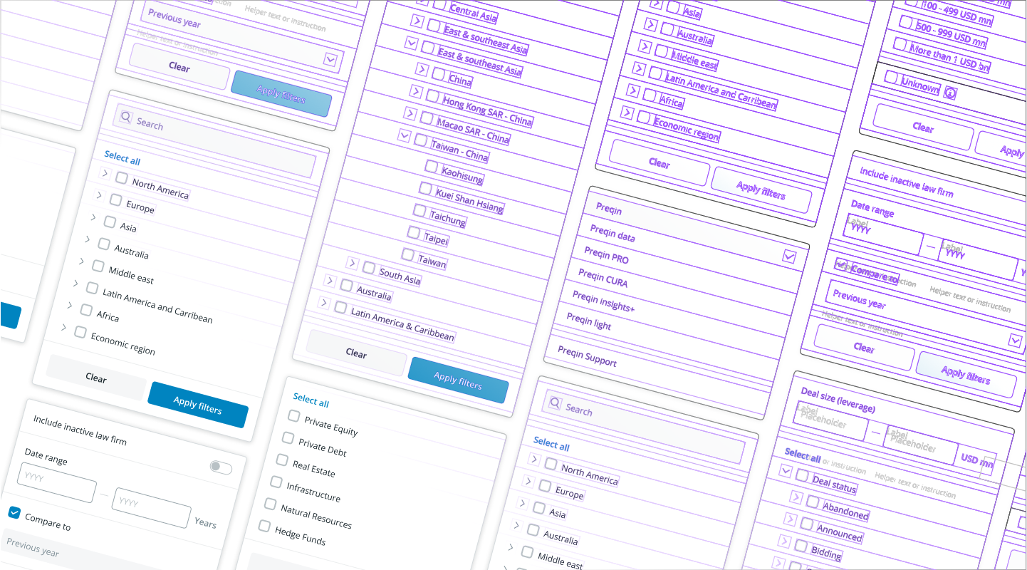
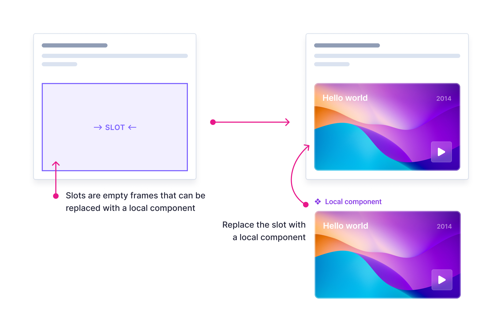
Slots are placeholder components in Figma. They are intentionally empty so that they can be replaced with a local component. Slots provide flexibility to create new designs within global component structure.

They can function as a bridge between local and some global components. Using the technique allows us to import global components into a file and then insert local UI within them without detaching.

Blocks

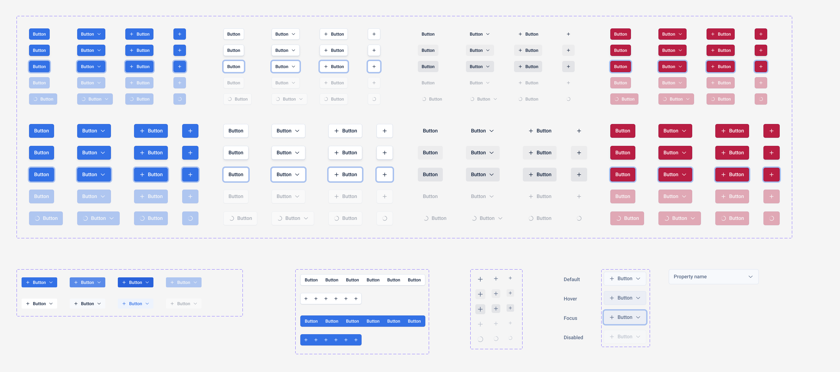
Blocks are visual components that can be stacked and arranged to create layouts. Some benefits of using blocks are:

  • Clean and consistent: create complex components that are still linked to the design system.
  • Fast: get your designs ready in seconds (or a few minutes if you’ve got something crazy).
  • Flexible: request to move something? Need to add a new option? Blocks got you covered.